Color is the silent narrator of style. It sets mood, influences perception, and creates connections before a single word is spoken. The perfect color palette can elevate a room, transform an outfit, or make a brand unforgettable. Whether you’re exploring aesthetic color palettes for clothing, web design, or interior projects, understanding how colors interact is the foundation for achieving any vision.
The Language of Color
Every hue carries emotional weight. Blue often signals calm, red conveys energy, yellow sparks optimism, and black adds drama. In aesthetics, the color scheme shapes the entire experience think muted earth tones for a cozy cottage core home versus neon gradients for a Y2K-inspired brand launch.
Aesthetic Color Palette Fundamentals
An aesthetic color palette is more than just picking favorite shades. It involves balance between contrast, harmony, and mood. The best palettes work across platforms from fabric swatches to digital hex color codes.
| Element | Purpose |
|---|---|
| Base Color | Sets the dominant tone |
| Accent Colors | Provide emphasis and guide attention |
| Neutral Shades | Balance brighter or darker elements |
| Contrast Hues | Add visual interest and prevent monotony |
Hex Color Codes and Why They Matter
When working in graphic design, web development, or branding, precision is non-negotiable. A hex code is a six-digit representation of a color in web-friendly format. For example:
Knowing these ensures color consistency across screens, print, and textiles.
Creating Color Combinations for Every Aesthetic
Here’s where the magic happens. Color combinations can drastically change the personality of an aesthetic.
| Aesthetic | Key Colors | Vibe |
|---|---|---|
| Minimalist | White, grey, beige | Clean, understated |
| Retro Pop | Red, yellow, turquoise | Energetic, nostalgic |
| Coastal | Ocean blues, sandy neutrals | Breezy, relaxed |
| Luxury Fashion | Black, gold, deep purple | Elegant, timeless |
| Pastel Dream | Peach, mint, lavender | Soft, whimsical |
| Dark Academia | Brown, deep green, muted gray | Intellectual, moody |
Pastel Color Palette: Soft Power in Design
A pastel color palette delivers a gentle, approachable feel. Often used in clothing, packaging, and web interfaces, it’s versatile and friendly without losing sophistication.
Pastel essentials:
These tones work beautifully when paired with neutrals like soft grey or warm beige to avoid looking overly sweet.
Blue: Versatile and Timeless
Blue remains one of the most universally loved colors. Its adaptability ranges from icy tones in winter aesthetics to rich navy in corporate branding.
Best pairings:
-
Navy with cream for elegance
-
Sky blue with white for freshness
-
Teal with coral for a modern twist
Black: The Ultimate Neutral
Black grounds nearly any color palette. In fashion, it offers instant sophistication; in graphic design, it brings clarity and focus. Pair it with metallics for luxury or pastels for contrast.
Pink: From Playful to Powerful
Soft blush suggests romance, while electric fuchsia makes a bold statement. The aesthetic color palette you choose dictates whether pink whispers or shouts.
White: Minimalist Backbone
White provides breathing room within a palette. It enhances contrast and makes brighter shades pop. In interiors, it reflects light and expands visual space.
Green: Nature’s Neutral
From muted sage to vibrant emerald, green works across aesthetics. Earth tones anchor rustic styles, while bright lime energizes modern graphics.
Red: Impact and Emotion
Red commands attention. In clothing, it can serve as a statement piece; in branding, it signals passion and urgency.
Yellow: Optimistic and Attention-Grabbing
Yellow radiates energy. Pair with navy for preppy sophistication or grey for a softer modern feel.
Purple: Regal and Mysterious
Historically linked to royalty, purple balances luxury and creativity. Lavender brings serenity, while deep plum adds drama.
Sunset Gradients: Warmth and Depth
Combining orange, pink, and gold mimics the natural beauty of a summer horizon. Perfect for editorial design and lifestyle branding.
Grey and Gray: Understated Strength
Whether spelled grey or gray, this neutral complements any aesthetic color palette. Cool greys work in minimalist schemes, while warm greys soften industrial interiors.
Orange: Energetic Accent
Orange sparks enthusiasm. Works well with complementary blue for striking contrast.
Brown: Earthy Foundation
Incorporate brown into palettes for grounding warmth, especially in rustic or vintage aesthetics.
Peach: Soft Warmth
Peach blends the approachability of pink with the cheerfulness of orange, perfect for pastel color palettes.
Ocean-Inspired Palettes
Blue, green, and sandy beige combine to evoke coastal calm. This works across clothing lines, interior decor, and travel branding.
Curating Your Own Palette
When you create a palette, consider:
-
Intended mood
-
Medium (fabric, web, print)
-
Cultural or brand associations
-
How colors perform under different lighting
Mint Green,Black,Lavender Floral
$119.50 USD
Butterfly Applique Sequin Mesh Babydoll Dress
$118.00 USD

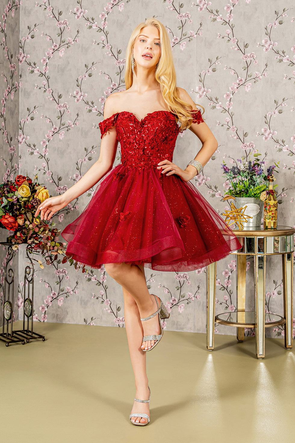
Sweetheart Off Shoulder Detachable Sleeves Short Cocktail Dress
$148.00 USD
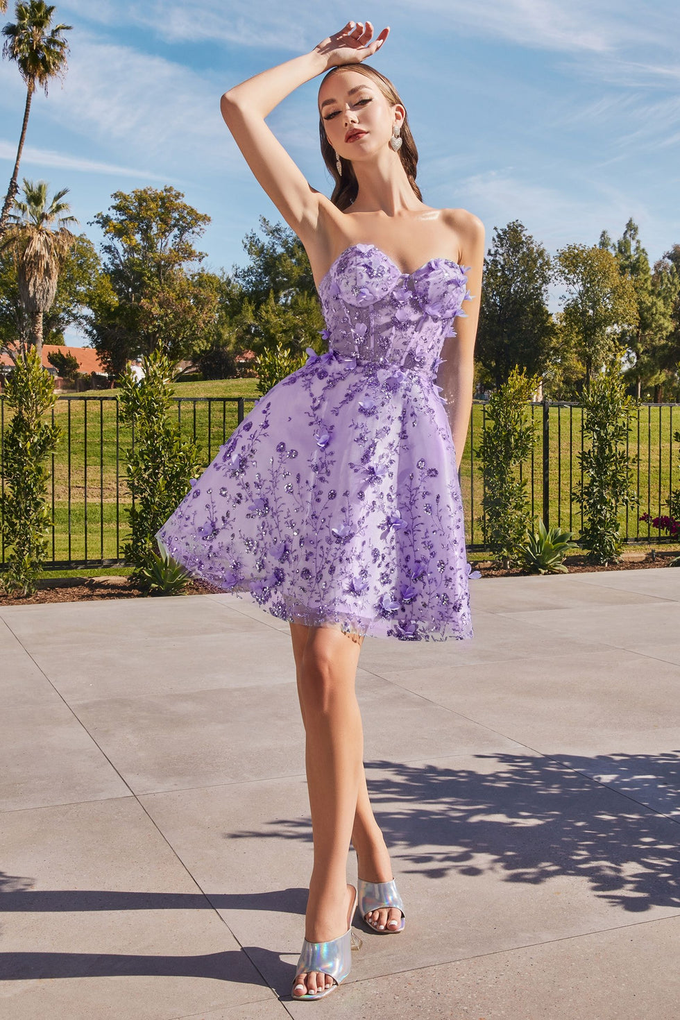
Lavender Off-Shoulder Glitter Tulle Gown
$178.00
FAQ: 10+ Unique Questions Answered
1. How do I choose an aesthetic color palette?
Identify the emotion you want to convey, then select hues that align with that mood.
2. Can black be in a pastel palette?
Yes it provides grounding contrast.
3. What colors work best for minimalist design?
White, grey, beige, and muted blues.
4. How do gradients affect perception?
They add depth and create a dynamic visual flow.
5. What’s the difference between grey and gray?
Only spelling usage depends on regional preference.
6. Are complementary colors always high contrast?
Typically, yes, but muted tones can soften the effect.
7. Which colors feel luxurious?
Deep purples, gold, rich blues, and black.
8. Can yellow work in winter palettes?
Yes pair mustard with deep navy or burgundy.
9. How do I keep a palette consistent across devices?
Use hex codes to maintain precision.
10. Is peach considered pink or orange?
It sits between both, leaning depending on surrounding hues.
11. Can green be a neutral?
Muted greens often act as a neutral base in earthy aesthetics.
Final Thoughts
Colors shape mood, memory, and identity. The right color combinations can transform the ordinary into something unforgettable, whether you’re styling a brand, redesigning a room, or selecting clothing for a new season. Understanding aesthetic color palettes means not only knowing the hues themselves but also the harmony they create together.
✍️ About the Author
Name: Shokhsanam Ganieva
Title: Content Creator & Content Strategist
Contact: LinkedIn
Location: Global rooted in trends, powered by data
Specialty: Deep-dives into self-care beauty trends, skincare science, and cosmetic branding